How I Finally Got My Patio Container Display Right
A color scheme I love, a design rule I didn’t know, and a lot of rearranging.
My first attempt was a disaster. I spent a good chunk of time arranging my patio container display, stepped back to admire my work, and my immediate reaction was — yuck. And then a storm blew in. No time to recover.
That failure taught me something. And now I’m genuinely excited about what’s happening on my patio. So let me walk you through how I got from “I hate it” to something I actually like.
The Color Scheme: Deep Purple & Rust
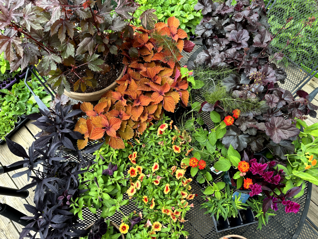
I started with a color scheme I used years ago in my Michigan garden: a deep, moody purple paired with rust accents. This combination feels dramatic which is exactly what I was going for.
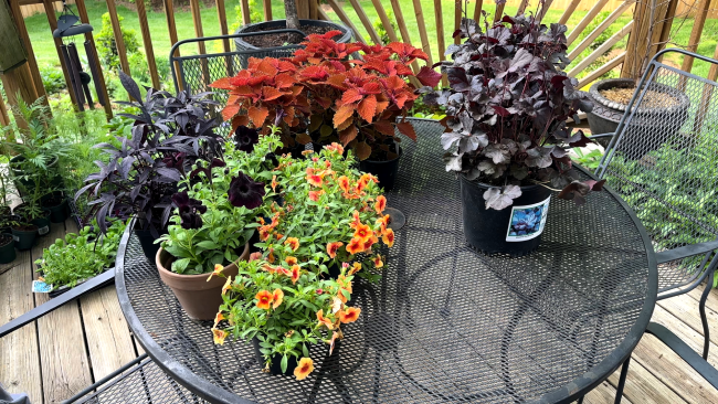
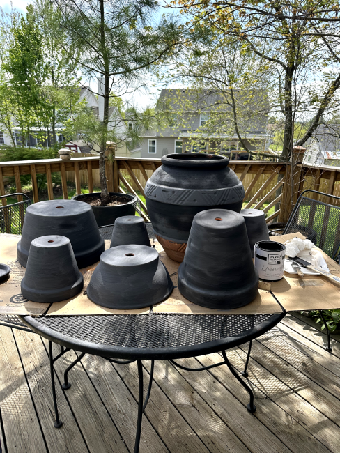
I had ordinary orange terracotta pots, and orange was going to compete with my rust-toned plants. I did a little research and discovered lime wash paint. I painted the terracotta pots charcoal grey.
I found out I can use lime wash paint to turn ordinary orange terracotta pots into my favorite charcoal gray without spending a fortune.
The lime-washed charcoal pots let the plants do the talking. They recede into the background and let that purple-and-rust palette sing.
What Went Wrong the First Time
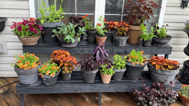
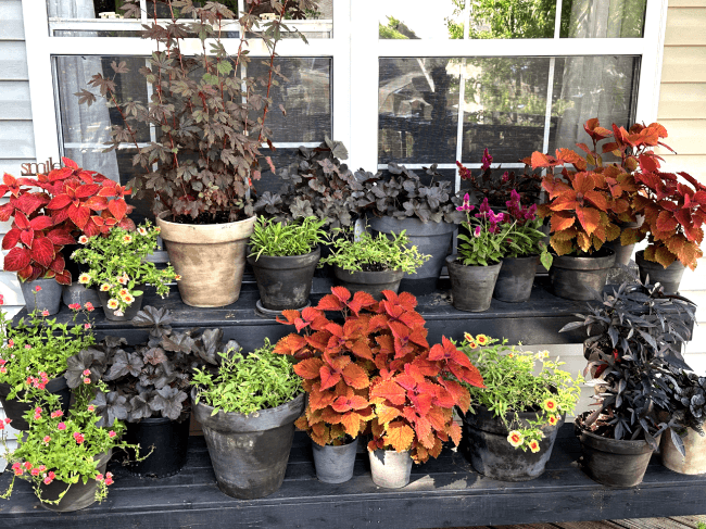
After painting the pots and buying the plants, I arranged everything on the shelf and stepped back. It just felt flat. Something was off, but I couldn’t put my finger on it.
Here’s the tip that actually unlocked the problem for me: take a photo of what isn’t working. Looking at a picture of my patio display made it obvious. The most eye-catching flowers were all lined up in a straight row across the shelf. Even though those flowers were the focal point, that horizontal line made the display feel one-dimensional.
Designer’s Trick
If something looks off but you can’t explain why, snap a photo and study it. What’s obvious to the eye in a flat image often gets lost when you’re standing right in front of it.
The Triangular Rule (And Why It Works)
I started thinking about how interior designers approach bookcase styling — because really, that’s what this is. And sure enough, there’s a well-known technique called the triangular rule.
Instead of placing your focal elements in a line, you create three visual points that form a triangle. This guides the eye naturally around the display and creates a sense of movement and depth.
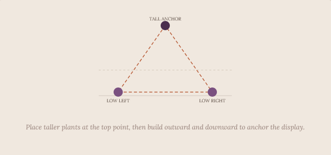
The idea is to place taller items at the back and build outward from there, creating three distinct focal points that frame the composition. Once I tried it, the difference was immediate.
How I Rebuilt the Display
Armed with the triangular rule, I started over. The first move was pulling those eye-catching plants out of their straight line and shifting them into a triangle shape. That became my guide for everything else.
From there, I layered in plants at different heights and positions.
Because the plants aren’t fully grown yet, I grouped the brighter ones together rather than spacing them out. Right now they need to work together to make an impact. As they grow and fill in, they’ll be able to stand more on their own.
The Result and What’s Next
Stepping back and looking at the finished display with the sun out, the color scheme really comes alive. The rust tones in the foliage, the deep purples, the charcoal pots — it all works together in a way that I love.
Is it perfect? No. I already know I’d like to add more rust colored blooms. You really could keep tweaking forever. But that’s part of the fun.
You just have to experiment. Take a photo when something doesn’t work, figure out why, and try again. If it’s not perfect. That’s okay. All you have to do is try again.
The fun part is watching everything grow and fill in over time — and knowing you’ll learn something new along the way. Even though there is more work to do, I try to remind myself where I started here at Rabbit Run. It’s been less than a year. Gardens take time.